Annual suite of event assets
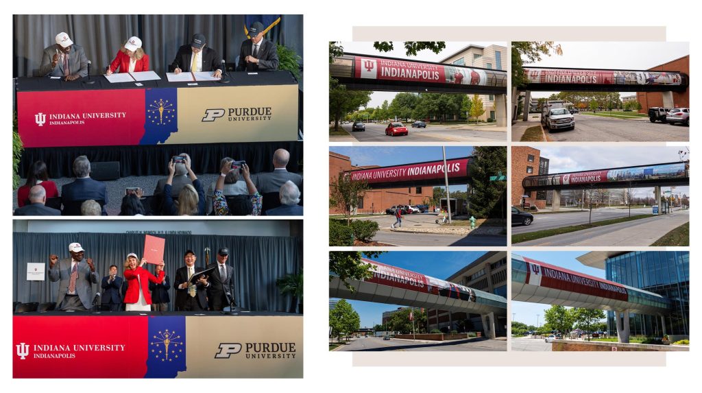
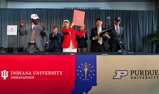
In summer 2023, IUPUI (Indiana University Purdue University Indianapolis) announced that after more than half a century of academic partnership, two separate and independent urban campuses would be created: Indiana University Indianapolis (IUI) and Purdue University in Indianapolis. This bold move focused IU’s journey toward newfound achievement, innovation, and global recognition on the state capital campus. The campus needed new branding to create a sense of place, build excitement for the student body, and reflect the university’s sharpened vision and strategic plan.
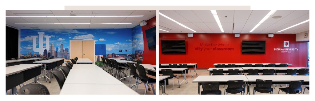
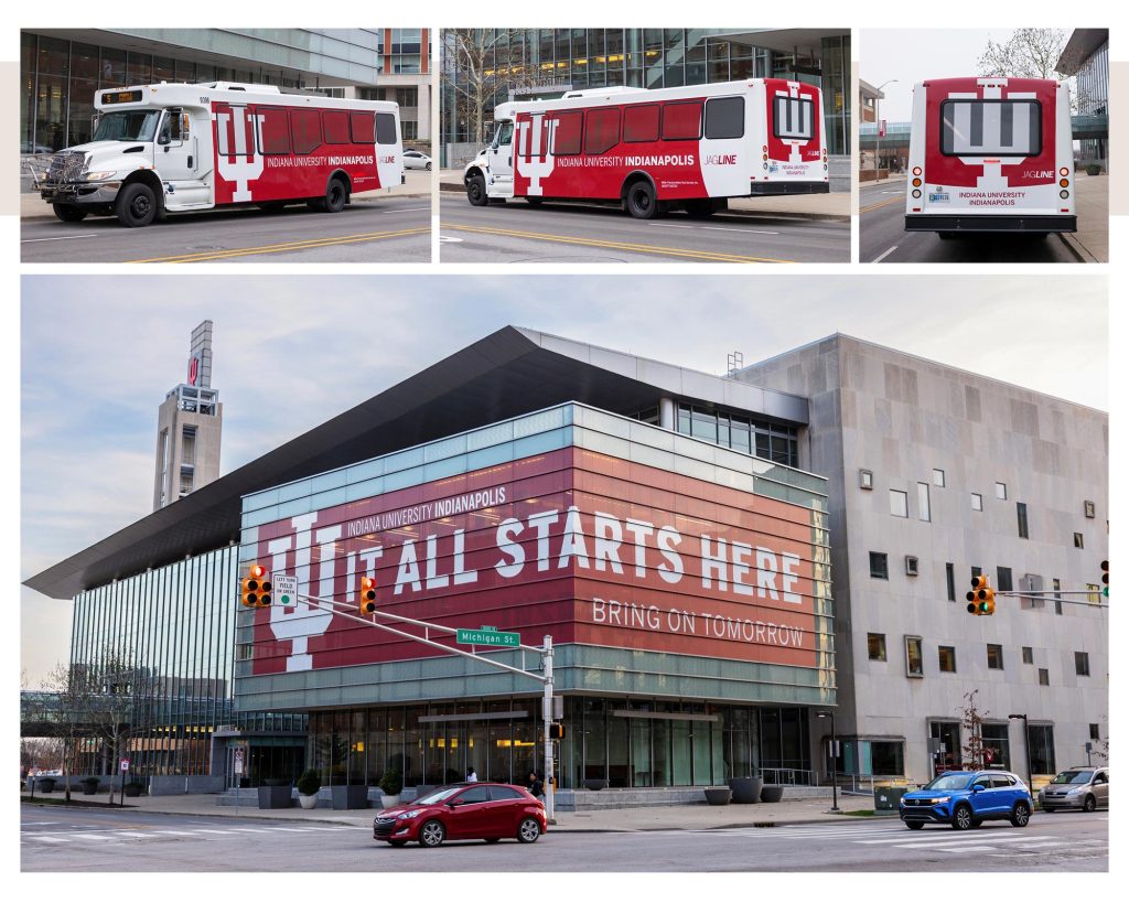
My team was tasked with transforming some of the largest-impact areas of campus with IU’s traditional red and white, including the iconic trident. As creative lead, I guided designers as we mapped out designs for twelve skywalks, redesigned Jagline campus shuttle wraps, and wrapped a corner of the central Campus Center building. We developed a vision for the campus tour room—where a prospective student’s experience of campus begins. The choice of limited photography allowed color and shape to thread common branding through the campus. Building on the Bring on Tomorrow campaign recently launched, the images representing healthcare, research, community, and Indy’s vibrant downtown integrated a white trident into the scene.
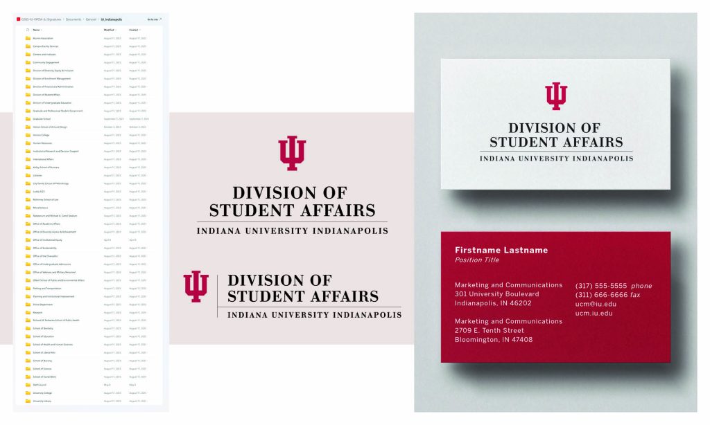
Working with marketing and communications leadership, I planned, coordinated, and paced a rollout of hundreds of formal identity signatures, which serve as branding for individual schools, departments, and divisions. After a thorough inventory of existing signatures, I led a team of designers in systematically updating the files with the new campus name. The organized resource was made available to staff to quickly begin branding new materials.
Lastly, leading up to the unveiling of a redesigned website on its first official day, I sourced, edited, and placed imagery for the majority of pages on indianapolis.iu.edu. With meticulous detail paid to avoiding now-outdated branding, I built a library of photos as a base. I then worked alongside a UX designer in Figma to visually track photo choice and progress, write corresponding alt text, and quickly assess that pages and sections did not feature duplicates or unbalanced selections.